Layout and illustrations of Easy Language publications
The graphic design of a publication is the gate to its contents. Typography, layout solutions and illustrations play a significant part in how interesting and understandable the message is. Apart from good readability, the appearance serves to awaken the reader’s interest.
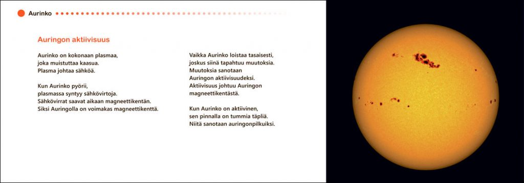
The typographic choices include, for example, font, font size, line length, line spacing and column structure. Easy Finnish publications use a slightly larger font size and ragged alignment. The recommended row length is 50-60 characters. The text is spaced so that each content entity is presented on its own row whenever possible. In addition, special attention needs to be paid to the use of colours and other visual elements.
The way in which readers of Easy Language publications understand images might be different compared to ordinary readers. Their interpretation of the text is also typically very strongly tied to the illustrations. Good illustrations give the readers important preliminary information and help them tune into reading the text. It is possible that bad and misplaced illustrations make it considerably harder to understand the connected text. An image can, for example, produce an entirely wrong interpretation if the emotional message it contains is contrary to the accompanying text.

